CLS — Cumulative Layout Shift
Cumulative Layout Shift (CLS) measures how much visible content unexpectedly moves around as a page loads. It's scored by summing the largest "session…
5 min read · updated 2026-08-14
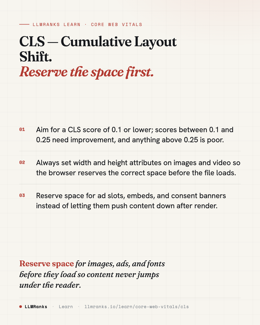
Cumulative Layout Shift (CLS) measures how much visible content unexpectedly moves around as a page loads. It's scored by summing the largest "session window" of layout shifts, where each shift's score is its impact fraction multiplied by its distance fraction. A good score is 0.1 or lower; anything above 0.25 is considered poor. Most CLS problems come from elements that load without reserving the space they'll eventually occupy.
How CLS is scored
CLS is one of the Core Web Vitals, alongside LCP and INP. Unlike those two, it isn't about speed — it's about visual stability.
The metric works by grouping layout shifts into session windows. A window can be at most 5 seconds long, with gaps of no more than 1 second between shifts. CLS reports the score of the single largest window rather than the total across the whole page. Shifts that happen within 500 milliseconds of a user interaction are excluded, on the assumption that movement right after a click or tap is usually expected.
Each individual shift score is the product of two fractions:
- Impact fraction — how much of the viewport the unstable element affected.
- Distance fraction — how far it moved relative to the viewport.
| Score | Rating |
|---|---|
| ≤ 0.1 | Good |
| 0.1 – 0.25 | Needs improvement |
| > 0.25 | Poor |
What causes layout shift
Most CLS comes from content that appears or resizes after the initial paint, pushing whatever was already on screen out of the way.
- Images without dimensions. An
<img>with nowidth/heightattributes or aspect-ratio CSS reserves 0×0 space. When the image finally loads, everything below it jumps down. - Ad slots. Programmatic ads with variable height are the single largest CLS contributor on news and content sites, because their final size isn't known until they fill.
- Web fonts swapping. When a fallback font has different metrics from the web font, text reflows the moment the web font loads.
- Dynamically injected content above existing content. Cookie banners, "you may also like" widgets, and A/B test variants that paint after the initial render push down whatever's beneath them.
- Embeds. YouTube, Twitter/X, and Instagram embeds without reserved space behave much like images with no dimensions.
- Animations using
top/left. These properties trigger layout, which is shift-eligible, whereas compositor-only properties are not.
Fixing images, video, and embeds
The most reliable fix is to tell the browser how much space to reserve before the resource arrives.
- Always set
widthandheightattributes on<img>and<video>. Browsers have computed aspect ratio automatically from these attributes since Chrome 79 and Firefox 71. - For responsive images, let
widthandheightset the intrinsic ratio while CSS controls the rendered size. For fluid containers, usestyle="aspect-ratio: 16/9; width: 100%; height: auto;". - For embeds, wrap the iframe in an aspect-ratio container so its space is reserved from the start. Better still, use a facade pattern — a static thumbnail that loads the iframe only on click. That also benefits LCP and INP, since the heavy embed never loads unless the user asks for it.
Fixing ads, banners, and injected content
Ads and dynamically inserted content are trickier because their dimensions can vary, but the principle is the same: reserve the space or keep the movement out of the way of existing content.
- Reserve ad slot heights with
min-heightmatching the most common ad size. For programmatic ads with variable sizes, either use a fixed-height container and accept some unfilled space, or use the ad network's sticky/anchor positioning to avoid shifts. - Render cookie consent banners at the bottom of the viewport (anchored), or render them above the fold from the very first paint with reserved space. Never inject them above existing content.
- Place dynamically inserted content below the fold, or use
content-visibility: autowith acontain-intrinsic-sizereservation so the browser knows how much room to leave.
Because ad slots are the biggest source of CLS on content-heavy sites, they deserve the most attention. If you rely on ad and consent scripts from external providers, review how they render — third-party script management covers the wider performance impact of those tags.
Fixing fonts and animations
Font swaps and animations cause smaller but still real shifts.
- Use
font-display: optional, or usesize-adjustand metric overrides to make the fallback font visually match the web font. Either approach eliminates the reflow that happens on swap. - Animate with
transform: translate()andopacityinstead oftopandleft. These properties are composited by the browser and don't cause layout shifts.
Where CLS fits in your wider work
CLS is a technical stability problem, so it belongs in your technical SEO workflow alongside the other Core Web Vitals. If you're weighing how much effort to put into these metrics overall, it's worth understanding whether Core Web Vitals affect rankings before you prioritize.
What to do
- Measure your current CLS and identify which elements are shifting — start with the largest offenders.
- Add
widthandheightattributes to every<img>and<video>, and setaspect-ratiofor fluid layouts. - Wrap embeds in aspect-ratio containers, or switch to a click-to-load facade pattern.
- Reserve ad slot space with
min-heightor a fixed-height container, and use anchored positioning for variable ads. - Move cookie banners and injected widgets out of the way — anchor them, reserve their space, or place them below the fold.
- Match your fallback font to your web font with
size-adjustor metric overrides, or usefont-display: optional. - Convert any
top/leftanimations totransformandopacity. - Re-measure and confirm your largest session window stays at or below 0.1.
save this card
 Download card
1080×1350 · post it anywhere
put it to work
See how ChatGPT, Gemini and Google AI actually talk about your brand.